Australia’s largest online legal platform enabling businesses and individuals to create documents, manage compliance, and connect with lawyers. I executed interaction design, information architecture, product strategy and design systems, across the web app and public website, to drive improvements in usability, delivery efficiency, and scalability.
Scope
B2B SaaS
UX Redesign
Design Systems
Problem
Lawpath helps Australian individuals and small businesses navigate legal documents, company registrations, and compliance. By 2021, the platform had grown quickly enough that its seams were showing. The support team was fielding a rising volume of tickets, and early analysis pointed to the same areas again and again: the Document Library, the Registrations flow, and the Dashboard.
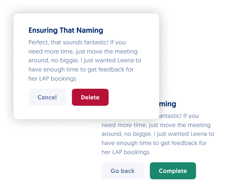
I partnered with the support team to synthesise six months of ticket data, grouping recurring complaints into themes. In parallel, I ran five contextual interviews with active users to understand how they were using the platform and where they felt lost. Two patterns emerged clearly: users were confused by stacked modals that obscured context in high-stakes flows like company registration, and they struggled to locate previously created documents once a task was complete.
Internally, the team faced a different but related problem: there was no shared design system. Designers and engineers were making different decisions in isolation, and Marketing-driven website changes were landing in the Engineering backlog, blocking core product work for days at a time.
Goals:
Enhance Usability:
Improve core product usability by simplifying key journeys and reducing friction across high-impact features.
Streamline Product Delivery:
Increase delivery efficiency by introducing a shared design system and clearer collaboration model across teams.
Enable Scalability:
Decouple marketing updates from engineering and establish a design foundation capable of supporting future growth and international expansion.
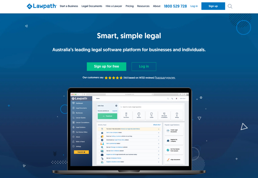
Previous public website's visual identity
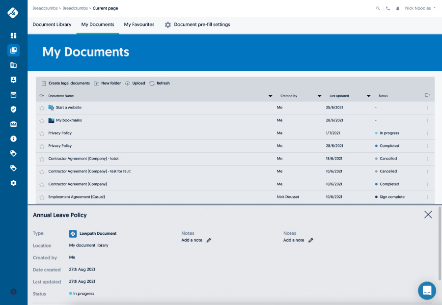
Lawpath's original Document Library interface
Process
I made a deliberate sequencing decision: before redesigning any user-facing flows, I would build the design system. This was controversial at first, it felt like slowing down to speed up. But the interview data made it clear that inconsistency was eroding user trust, and redesigning flows on top of inconsistent components would just push the problem downstream.
Using atomic design principles, I built a component library of over 70 components, from foundational tokens (colour, spacing, type scale) up to complex organisms like modals, form patterns, and navigation structures. Each component was documented with usage guidelines and annotated for Engineering. I also standardised responsive breakpoints and layout rules, which alone eliminated a significant source of handoff ambiguity.
For the UX redesign work, I used journey mapping workshops with the PM and the lead front-engineer to align the team on where the biggest friction points were before any screens were drawn. For each major flow, I ran a heuristic evaluation and then moved into low-fidelity wireframes for internal review before prototyping. Usability testing on the new Registration flow (five moderated sessions) confirmed that removing the stacked modal pattern and introducing a persistent progress indicator significantly reduced user uncertainty.
The public website migration to Elementor was framed as a governance project as much as a design one. I created a style guide layer within Elementor that was governed by the design system, so Marketing could make content changes without breaking design standards. I ran a handover session with the Marketing team to ensure they could operate independently.
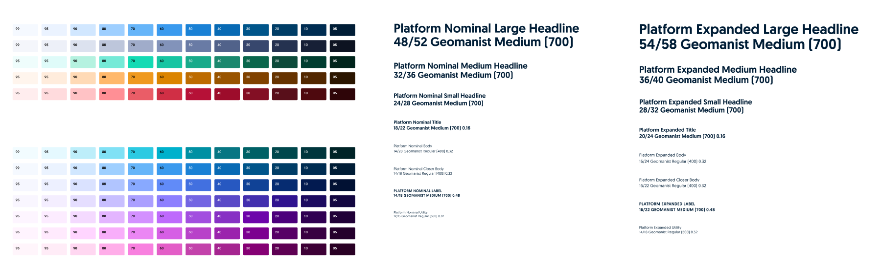
The new design system distinguished colours into semantic - mostly used in the web app, and expressive - aimed for marketing and brand identity. In parallel, typographies were split into nominal and expanded to increase the possibilities in terms of responsiveness.
Expressive colours have an analogous relationship to allow for unlimited creative applications of the palette
Each semantic colour is tied to its own meaning
Results
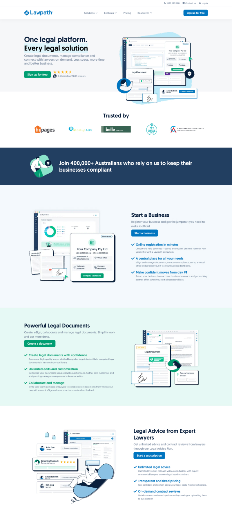
Redesigned website homepage, with improved visual appeal and performance metrics
1. Improved user experience:
Simplifying journeys across key areas created a smoother and more intuitive experience for users. Most significantly, it caused a 45% drop in document management related support tickets. Reducing unnecessary steps, removing stacked modals, and clarifying information hierarchy improved usability, while the design system ensured visual consistency between the web app and public website. These changes led to higher user satisfaction, more efficient interactions, and a noticeable increase in positive feedback.
2. Measurable business impact:
The public website redesign, combined with the adoption of a no-code platform, delivered a 30% increase in traffic within the first month. Marketing was able to manage content independently, and Engineering could focus on core product work, saving roughly a day per sprint on average. The design system also minimised inconsistencies, reduced rework, and accelerated the release of new features, improving both internal efficiency and overall product quality.
3. Adaptability and Scalability:
The design system and standardised workflows established a foundation for scaling the platform, including Lawpath’s US launch in late 2022. Component-based structures and responsive standards made it easier to adapt features to new markets and evolving user needs. Cross-functional alignment improved, ensuring that future enhancements could be delivered efficiently while maintaining usability and visual consistency across the product.
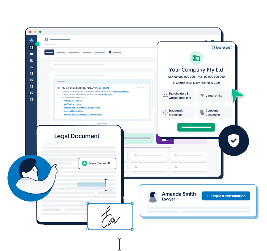
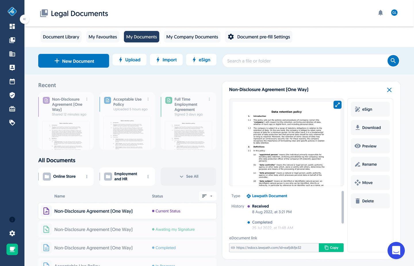
A redesigned Document Library boasted clarity with higher contrast levels and more efficient responsive behaviour, creating room for new functionality to be implemented, as the document preview, for example
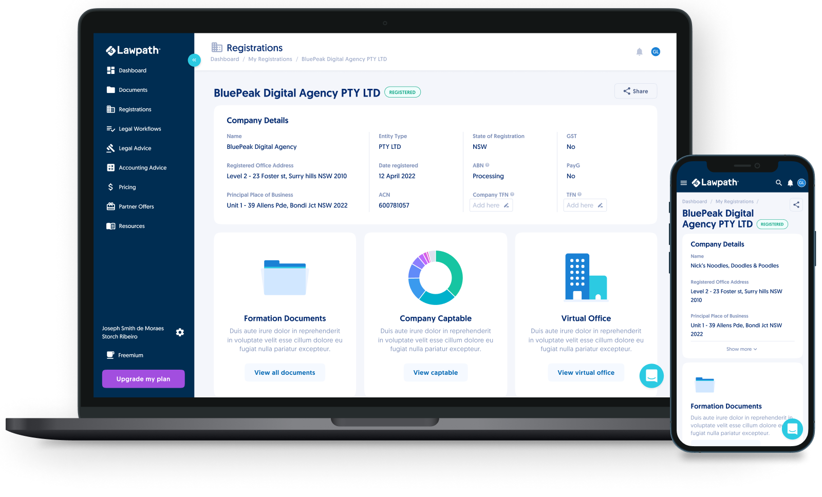
Redesigned Registration main section turned truly responsive, alongside all other sections with the usage of a comprehensive design system
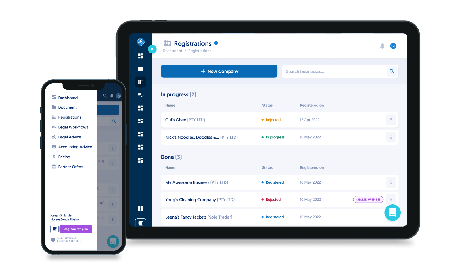
The Registrations list view displays coherence throughout sections, taking advantage of reusable components